Color Picker
Accessible color picker combining WCAG compliance with patterns.
Project Overview #
An accessible color picker for the design system that pairs WCAG-compliant colors with patterns and icons, so color is never the only way to tell labels apart.
ROLE: Designer
STACK: Figma, CSS, React library
STATUS: Launched
Introduction #
A color picker is not accessible by nature, so the goal of this component design was to provide a solution that not only allowed users to select colors for labels, but also provide alternatives such as patterns and icons.
Getting Started #
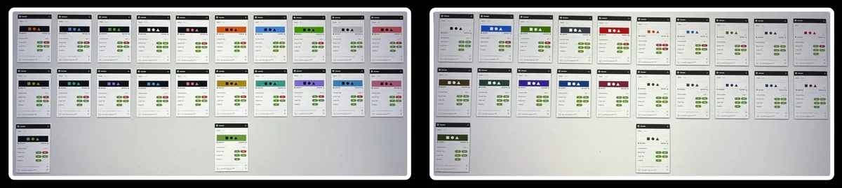
To start, a basic set of colors were chosen from the available color palette (as defined in the design system). Each color was verified against a light background (#ffffff) and a dark background (#010101), as well as against multiple layers.
In total, forty-four (44) combinations met WCAG AA compliance, with eighteen (18) meeting WCAG AAA compliance.
Next Steps #
After the colors had been established, I worked with the PM and Dev team to determine the first components to test these with.
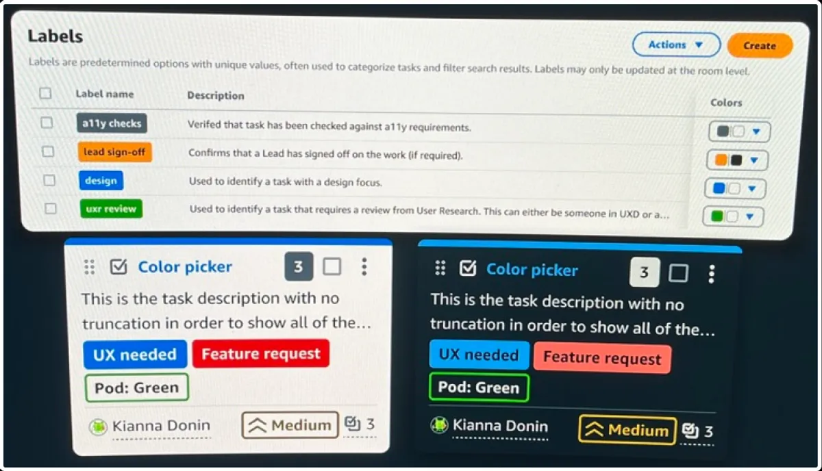
It was determined that Labels would be the best place to start, as they were the most ubiquitous across the system.
Comparisons and Testing #
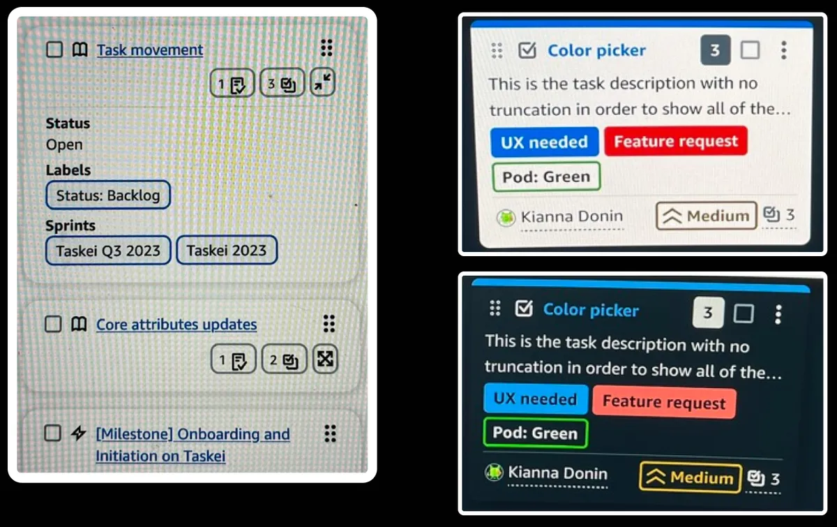
Once the basic levels had been configured, I needed to compare the current label coloring scheme to what the new component provided. This required working with the development team to create a prototype environment that allowed the component to be used in real-time without surfacing the in-progress work to the production users.
Findings #
Once the prototype was up and running, I was able to test out the interactions, visuals, and test the new component with users.
The color picker launched to production. The findings from this round also fed follow-up work: another round of design and testing.